Source: assets/src/css/5-components/_5-readme.scss, line 1
5 Components
Re-usable UI components. Namespace these classes with o-. Use BEM syntax.
Source: assets/src/css/5-components/_5-readme.scss, line 1
Re-usable UI components. Namespace these classes with o-. Use BEM syntax.
Source: assets/src/css/5-components/_c-ad.scss, line 1
Generic ad styles
Multi-size Leaderboard ad
Leaderboard ad
Standard big box ad
Big box / Double big box ad
Left align label (centered by default)
Dark background
No background
<div class="c-ad [modifier class]">
	<div class="c-ad__label">Advertisement</div>
		<div class="c-ad__unit">
		<div style="width:100%;height:100%;background-color:#ccc"></div>
     </div>
</div>
Source: assets/src/css/5-components/_c-ad--mostPopular.scss, line 6
Native ad styles displayed in a post grid

<div class="c-ad c-ad--storyStream c-ad--storyStreamTile c-ad--noBackground c-ad--otf">
	<div id="gpt-ad-22-1-content" class="c-ad__placeholder">
	<div class="c-ad__container">
		<div class="c-posts__inner c-ad__inner">
		<a href="" title="Are green roofs just a trend? How this sustainable solution can help you save energy" class="c-posts__media c-ad__media">
			<img src="https://shawglobalnews.files.wordpress.com/2019/08/scott2018.jpg?quality=70&strip=all&w=256&h=144&crop=1" class="c-ad__thumbnail c-posts__thumbnail">
		</a>
		<div class="c-posts__details c-ad__details">
			<a href="" title="Are green roofs just a trend? How this sustainable solution can help you save energy" class="c-posts__headline c-ad__headline">
				Are green roofs just a trend? How this sustainable solution can help you save energy
			</a>
			<div class="c-ad__excerpt">
				Lorem ipsum dolor sit amet, consectetur adipiscing elit. Integer eu commodo felis, id imperdiet nunc.
			</div>
			<div class="c-ad__sponsor">
				<a href="" title="In partnership with  City of Toronto" class="c-ad__sponsorLink" target="_blank">
					<img src="https://shawglobalnews.files.wordpress.com/2019/08/toronto-logo.png?w=76" class="c-ad__sponsorLogo">
				</a>
				<div class="c-ad__sponsorInfo">
					<span class="c-ad__sponsorLabel">In partnership with</span>
					<a href="" title="In partnership with  City of Toronto" class="c-ad__sponsorLink c-ad__sponsorName" target="_blank">
						 City of Toronto
					</a>
				</div>
				<span class="c-ad__icon">
					<svg class="c-ad__icon--question c-icon"><use xlink:href="#question"></use></svg>
				</span>
			</div>
		</div>
	</div>
	</div>
</div>
Source: assets/src/css/5-components/_c-ad--storyStream.scss, line 6
Native ad styles displayed in a post grid
<div class="c-ad c-ad--storyStream c-ad--noBackground c-ad--otf">
	<div id="gpt-ad-22-1-content" class="c-ad__placeholder">
	<div class="c-ad__container">
		<div class="c-posts__inner c-ad__inner">
		<a href="" title="Are green roofs just a trend? How this sustainable solution can help you save energy" class="c-posts__media c-ad__media">
			<img src="https://shawglobalnews.files.wordpress.com/2019/08/scott2018.jpg?quality=70&strip=all&w=256&h=144&crop=1" class="c-ad__thumbnail c-posts__thumbnail">
		</a>
		<div class="c-posts__details c-ad__details">
			<a href="" title="Are green roofs just a trend? How this sustainable solution can help you save energy" class="c-posts__headline c-ad__headline">
				Are green roofs just a trend? How this sustainable solution can help you save energy
			</a>
			<div class="c-ad__excerpt">
				Lorem ipsum dolor sit amet, consectetur adipiscing elit. Integer eu commodo felis, id imperdiet nunc.
			</div>
			<div class="c-ad__sponsor">
				<a href="" title="In partnership with  City of Toronto" class="c-ad__sponsorLink" target="_blank">
					<img src="https://shawglobalnews.files.wordpress.com/2019/08/toronto-logo.png?w=76" class="c-ad__sponsorLogo">
				</a>
				<div class="c-ad__sponsorInfo">
					<span class="c-ad__sponsorLabel">In partnership with</span>
					<a href="" title="In partnership with  City of Toronto" class="c-ad__sponsorLink c-ad__sponsorName" target="_blank">
						 City of Toronto
					</a>
				</div>
				<span class="c-ad__icon">
					<svg class="c-ad__icon--question c-icon"><use xlink:href="#question"></use></svg>
				</span>
			</div>
		</div>
	</div>
	</div>
</div>
Source: assets/src/css/5-components/_c-ad--storyStreamTile.scss, line 6
Native ad styles displayed in a post grid
<div class="c-ad c-ad--storyStream c-ad--storyStreamTile c-ad--noBackground c-ad--otf">
	<div id="gpt-ad-22-1-content" class="c-ad__placeholder">
	<div class="c-ad__container">
		<div class="c-posts__inner c-ad__inner">
		<a href="" title="Are green roofs just a trend? How this sustainable solution can help you save energy" class="c-posts__media c-ad__media">
			<img src="https://shawglobalnews.files.wordpress.com/2019/08/scott2018.jpg?quality=70&strip=all&w=256&h=144&crop=1" class="c-ad__thumbnail c-posts__thumbnail">
		</a>
		<div class="c-posts__details c-ad__details">
			<a href="" title="Are green roofs just a trend? How this sustainable solution can help you save energy" class="c-posts__headline c-ad__headline">
				Are green roofs just a trend? How this sustainable solution can help you save energy
			</a>
			<div class="c-ad__excerpt">
				Lorem ipsum dolor sit amet, consectetur adipiscing elit. Integer eu commodo felis, id imperdiet nunc.
			</div>
			<div class="c-ad__sponsor">
				<a href="" title="In partnership with  City of Toronto" class="c-ad__sponsorLink" target="_blank">
					<img src="https://shawglobalnews.files.wordpress.com/2019/08/toronto-logo.png?w=76" class="c-ad__sponsorLogo">
				</a>
				<div class="c-ad__sponsorInfo">
					<span class="c-ad__sponsorLabel">In partnership with</span>
					<a href="" title="In partnership with  City of Toronto" class="c-ad__sponsorLink c-ad__sponsorName" target="_blank">
						 City of Toronto
					</a>
				</div>
				<span class="c-ad__icon">
					<svg class="c-ad__icon--question c-icon"><use xlink:href="#question"></use></svg>
				</span>
			</div>
		</div>
	</div>
	</div>
</div>
Source: assets/src/css/5-components/_c-ageGate.scss, line 1
Age gate form
<form id="age-gate-form" class="c-ageGate is-attempted">
<div class="c-ageGate__section">
	To continue on to this <strong>cannabis related content</strong> you must confirm you are of legal age.
</div>
<div class="c-ageGate__section c-ageGate__section--center">
	<div class="c-ageGate__row">
		<select name="age-gate-day" id="age-gate-day">
			<option value="01">01</option>
		</select>
		<select name="age-gate-month" id="age-gate-month">
			<option value="32">SEP</option>
		</select>
		<select name="age-gate-year" id="age-gate-year">
			<option value="2019" selected="">2019</option>
		</select>
	</div>
	<div class="c-ageGate__row">
		<select name="age-gate-province" id="age-gate-province" required="">
			<option value="">Select Province</option>
		</select>
	</div>
</div>
<div class="c-ageGate__section">
	<div class="c-ageGate__field">
		<input name="age-gate-checkbox" id="age-gate-checkbox" type="checkbox" required="">
		<label class="c-ageGate__label" for="age-gate-checkbox">Remember me for 30 days. I confirm this device is not shared with anyone under the age of 19.</label>
	</div>
</div>
<div class="c-ageGate__section c-ageGate__section--center">
	<input type="submit" value="submit" id="age-gate-submit" class="c-button">
</div>
</form>
Source: assets/src/css/5-components/_c-backToTop.scss, line 1
Back To Top button styling
<div class="c-backToTop is-slid-and-faded-out">
	<button class="c-backToTop__button">
		<span class="sr-only">Scroll back to top of the page</span>
		<svg class="c-icon c-backToTop__icon">
			<use xlink:href="../assets/dist/icons/out/symbol/svg/sprite.symbol.svg?v=padpecwee#dropdown_arrow_white"></use>
		</svg>
		Back to top
	</button>
</div>
Source: assets/src/css/5-components/_c-blockquote.scss, line 1
Pull quote styles
My quotation...
Tweet This
Hides blockquote button
My quotation...
Tweet This
<blockquote class="c-blockquote [modifier class] l-article__blockquote">
<p class="c-blockquote__content l-article__blockquoteContent">My quotation...</p>
<a href="" title="Tweet This" class="c-blockquote__button" target="_blank">
		<svg class="c-social__icon c-social__icon--twitter c-icon c-blockquote__Icon" focusable="false">
			<use xlink:href="../assets/dist/icons/out/symbol/svg/sprite.symbol.svg?#twitter"></use>
	</svg>
	Tweet This
</a>
</blockquote>
Source: assets/src/css/5-components/_c-button.scss, line 1
Simple button style currently used in the site header and for form submission
<a class="c-button ">WATCH</a>Source: assets/src/css/5-components/_c-byline.scss, line 1
Article byline displays on article template below the title. If there are more than 2 authors, byline will not display author photos. For 2 or less authors both photos will display on desktop and tablet, and only 1st photo on mobile. For authors outside of Global News byline will not display photo and will not link to staff page. For smaller mobile size all author photos will be hidded


<div class="c-byline l-article__byline">
<div class="c-byline__images c-byline__images--multiple">
<img class="c-byline__image" src="https://shawglobalnews.files.wordpress.com/2018/09/adam-wallis-head-shot.jpg?quality=100&strip=all&w=68&h=68&crop=1">
<img class="c-byline__image" src="https://shawglobalnews.files.wordpress.com/2018/05/goqn4pzj_400x400.jpg?quality=100&strip=all&w=68&h=68&crop=1">
</div>
<div class="c-byline__text">
<div class="c-byline__attribution">
By <a class="c-byline__link" href="#">Adam Wallis</a> and
<a class="c-byline__link" href="#">Graeme Benjamin</a>
<span class="c-byline__source">Global News</span>
</div>
<div class="c-byline__date">Posted April 25, 2019 10:22 am</div>
<div class="c-byline__date">Updated May 1, 2019 9:25 am</div>
</div>
</div>Source: assets/src/css/5-components/_c-byline--longform.scss, line 6
This variation of byline appears on longform article template It displays Read time estimate, hides source and updated time, has custom color link option

<div id="article-byline" class="c-byline c-byline--longform">
 <div class="c-byline__images c-byline__images--single">
    <img class="c-byline__image" height="68" width="68" src="https://globalnews.ca/wp-content/themes/shaw-globalnews/assets/dist/images/author-placeholder.jpg">
  </div>
  <div class="c-byline__text">
    <div class="c-byline__attribution">
      <span class="c-byline__by">by </span>
      <a href="" title="" class="c-byline__link"></a>
    </div>
    <div class="c-byline__dates">
      <div class="c-byline__date c-byline__published"></div>
      <svg class="c-icon c-byline__clock" focusable="false">
        <use xlink:href="../assets/dist/icons/out/symbol/svg/sprite.symbol.svg#clock"></use>
      </svg>
      <div class="c-byline__date c-byline__readTime"></div>
    </div>
  </div>
</div>
Source: assets/src/css/5-components/_c-caption.scss, line 1
Caption associated with image or video
	<figcaption class="c-caption">
		<span class="c-caption__desc">This is an image of dogs playing poker</span>
		<cite class="c-caption__cite">Getty Images / Testario Examplini</cite>
	</figcaption>
Source: assets/src/css/5-components/longform/caption.scss, line 1
Caption associated with image or video
	<figcaption class="c-caption c-longform-caption">
		<span class="c-caption__desc">This is an image of dogs playing poker</span>
		<cite class="c-caption__cite">Getty Images / Testario Examplini</cite>
	</figcaption>
Source: assets/src/css/5-components/_c-copyright.scss, line 1
Copyright is found above article title Displays on tablet, desktop and mobile
<div class="c-copyright">
© 2019 Global News, a division of Corus Entertainment Inc.
</div>Source: assets/src/css/5-components/_c-counter.scss, line 1
A counter that displays the current image count out of total number of images.
counter that is spaced further out.
	<div class="c-counter">
		<span class="c-counter__current">1</span><span class="c-counter__total">10</span>
</div>
Source: assets/src/css/5-components/_c-credits.scss, line 1
Full credits with multiple rows for optional complete attribution at the bottom of a post. Currently used in the long form template.
<section class="c-credits">
	<div class="c-credits__inner">
		<h4 class="c-credits__heading">CREDITS</h4>
		<ul class="c-credits__list">
			<li class="c-credits__row">
				<div class="c-credits__type">Reporting</div>
				<a class="c-credits__name c-credits__name--link" href="#">Reep Orter</a>
			<span class="c-credits__name">Guest Author</span>
			</li>
			<li class="c-credits__row">
				<div class="c-credits__type">Design and Illustrations</div>
				<a class="c-credits__name c-credits__name--link" href="#">Dee Ziner</a>
			</li>
			<li class="c-credits__row">
				<div class="c-credits__type">Development</div>
				<a class="c-credits__name c-credits__name--link" href="#">Dev Eloper</a>
			</li>
		</ul>
	</div>
</section>
Source: assets/src/css/5-components/_c-dataTracker.scss, line 1
Component used to display data summary
<div id="home-tracker" class="l-section__widget">
<div class="c-dataTracker">
	<div class="c-dataTracker__title">ontario cases</div>
	<div class="c-dataTracker__lastUpdated">Last Updated: 2020-04-14, 2:34:52 pm ET</div>
	<div class="c-dataTracker__entries">
		<div class="c-dataTracker__entry">
			<span class="c-dataTracker__label">Confirmed Cases</span>
			<span class="c-dataTracker__value">7953</span>
			<span class="c-dataTracker__diff">483</span>
		</div>
	<div class="c-dataTracker__entry">
			<span class="c-dataTracker__label">Deaths</span>
			<span class="c-dataTracker__value">334</span>
			<span class="c-dataTracker__diff">43</span>
		</div>
	</div>
	<div class="c-dataTracker__source">Source: Esri Canada</div>
	<div class="c-dataTracker__footnote">Totals and averages do not include daily Saskatchewan data.</div>
	</div>
</div>
Source: assets/src/css/5-components/_c-editButton.scss, line 1
Edit button that appears when you hover over an embed. This was created so logged-in users can easily edit video embeds.
<div class="c-editButton">
<a class="c-editButton__link">Edit Video</a>
</div>
Source: assets/src/css/5-components/_c-editorsNote.scss, line 1
	<div class="c-editorsNote">
	<div class="c-editorsNote__message">
	</div>
</div>
Source: assets/src/css/5-components/_c-electionPromise.scss, line 1
Used in [election-promise] shortcode to add content political party promise blurb
Source: assets/src/css/5-components/_c-fbComments.scss, line 1
FB Comments widget is consisted of a messaging area and FB widget embed area. The FB widget is loaded asynchronously. Before the widget has finished loading, a placeholder is shown to indicate the widget is in loading state.
<div class="c-fbComments">
		<div class="c-fbComments__message">
		<p class="small">Want to discuss? Please read our <a href="#" target="_blank" title="">Commenting Policy</a> first.</p>
	</div>
	<div class="c-fbComments__embed"></div>
	<div class="c-fbComments__placeholder">
		<div class="c-shimmer">
			<span class="c-fbComments__dummyProfile"></span>
			<span class="c-fbComments__dummyText"></span>
		</div>
	</div>
</div>
Source: assets/src/css/5-components/_c-figure.scss, line 1
Self contained content with caption, such as a featured image or embed
contain an image with a 3:2 box
<figure class="c-figure [modifier class]">
	<div class="c-figure__inner">
		<div class="c-figure__imageWrapper">
		<img class="c-figure__image"
				alt="some image"
				src="//via.placeholder.com/600x400"
				srcset=""
				sizes=""
				width="600"
				height="400"
			/>
	</div>
		<figcaption class="c-figure__caption c-caption">
				<span class="c-caption__desc">This is an image of dogs playing poker</span>
				<cite class="c-caption__cite">Getty Images / Testario Examplini</cite>
		</figcaption>
</div>
</figure>
Source: assets/src/css/5-components/_c-figure--longform.scss, line 1
@define c-figure
Self contained content with caption, such as a featured image or embed
max width of 1024
Takes up full width of browser, with 1920px max width
image floats to the left
image floats to the right
image center aligned, without stretching to match container width
<figure class="c-figure [modifier class]">
<div class="c-figure__inner">
		<div class="c-figure__imageWrapper">
		<img class="c-figure__image"
				alt="some image"
				src="//via.placeholder.com/600x400"
				srcset=""
				sizes=""
				width="600"
				height="400"
			/>
	</div>
		<figcaption class="c-figure__caption c-caption">
				<span class="c-caption__desc">This is an image of dogs playing poker</span>
				<cite class="c-caption__cite">Getty Images / Testario Examplini</cite>
		</figcaption>
</div>
</figure>
Source: assets/src/css/5-components/_c-flyers.scss, line 1
Flyers is found below outbrain and above comments on article page Displays on tablet, desktop and mobile
<div class="c-flyers">
	<div class="c-flyers__header">
		<span class="c-flyers__title c-heading--component">FLYERS</span>
		<a class="c-flyers__link c-link" href="[MAIN FLYER PAGE]">
			<span class="c-flyers__label c-link__label">MORE WEEKLY FLYERS</span>
			<span class="c-flyers__icon c-link__icon"></span>
	</a>
	</div>
<div class="c-flyers__embed"></div>
	<div class="c-flyers__skeleton">
		<div class="c-flyers__skeletonBox c-shimmer"></div>
	</div>
</div>
Source: assets/src/css/5-components/_c-fontSizer.scss, line 1
Displays in article template beside byline.
<div class="c-fontSizer">
<div class="c-fontSizer__item">
<button class="c-fontSizer__button c-fontSizer__button--decrease c-button c-button--details">
	<span class="sr-only">Descrease article font</span>
		<svg class="c-icon c-fontSizer__icon" focusable="false">
			<use xlink:href="https://globalnews.ca/wp-content/themes/shaw-globalnews/assets/dist/icons/out/symbol/svg/sprite.symbol.svg?v=higtevx6z#font-increase"></use>
		</svg>
</button>
</div>
<div class="c-fontSizer__item">
<button class="c-fontSizer__button c-fontSizer__button--increase c-button c-button--details">
	<span class="sr-only">Increase article font</span>
		<svg class="c-icon c-fontSizer__icon" focusable="false">
			<use xlink:href="https://globalnews.ca/wp-content/themes/shaw-globalnews/assets/dist/icons/out/symbol/svg/sprite.symbol.svg?v=higtevx6z#font-decrease"></use>
		</svg>
</button>
</div>
</div>
Source: assets/src/css/5-components/_c-gallery.scss, line 1
<div id="gallery" class="c-gallery c-gallery--animateIn">
<div class="c-gallery__inner">
	<ul class="c-gallery__slides">
		<li class="c-gallery__slide c-gallery__slide--current">
			<img class="c-gallery__image" src="https://via.placeholder.com/1111x720" alt=""/>
		</li>
		<li class="c-gallery__slide c-gallery__slide--current">
			<img class="c-gallery__image" src="https://via.placeholder.com/1111x720" alt=""/>
		</li>
		<li class="c-gallery__slide c-gallery__slide--current">
			<img class="c-gallery__image" src="https://via.placeholder.com/1111x720" alt=""/>
		</li>
	</ul>
	<div class="c-gallery__sidebar">
		<div class="c-gallery__buttons">
			<div class="c-gallery__social"></div>
			<div id="gallerySocialPopup" class="c-gallery__socialPopup l-panel l-panel--socialArticle"></div>
			<a href="" title="Close gallery" class="c-gallery__button c-gallery__close" data-trackaction="gallery | close">
				<svg class="c-gallery__icon"><use xlink:href="#minimize"></use></svg>
			</a>
		</div>
		<div class="c-gallery__caption c-caption">
			<div class="c-gallery__desc c-caption__desc">Soccer Football - World Cup 2022 South American Qualifiers - Argentina v Paraguay</div>
			<div class="c-gallery__cite c-caption__cite">REUTERS/Marcelo Endelli</div>
		</div>
		<div class="c-gallery__adContainer">
			<div class="c-gallery__ad c-ad c-ad--left c-ad--bigbox">
				<div class="c-ad__label">Advertisement</div>
				<div class="c-gallery__adUnit c-ad__unit--loaded" id="galleryAd-2"></div>
			</div>
		</div>
		<div class="c-gallery__pagination">
			<div class="c-gallery__label c-caption">
				Image <span class="c-gallery__current">1</span> of <span class="c-gallery__total">3</span>
			</div>
			<div class="c-gallery__arrowButtons">
				<a href="" title="Next slide" class="c-gallery__button c-gallery__prev c-gallery__button--disabled">
					<div class="c-gallery__icon"></div>
				</a>
				<a href="" title="Previous slide" class="c-gallery__button c-gallery__next" data-trackaction="gallery | next slide">
					<div class="c-gallery__icon"></div>
				</a>
			</div>
		</div>
	</div>
</div>
</div>
Source: assets/src/css/5-components/_c-heading.scss, line 1
Site heading styles (can be used on any heading tag: h1, h2, h3, etc)
Primary heading style
Secondary heading style
Component heading style
Subheading style (can be used in conjunction with another heading)
Heading style for region selection menu
<h2 class="c-heading [modifier class]">Site Heading</h2>Source: assets/src/css/5-components/_c-headingButton.scss, line 1
A heading accompanied with a button When button is clicked, a submenu opens
<div class="l-section__heading c-headingButton">
<h1 class="c-heading c-heading--page c-headingButton__heading">Toronto</h1>
		<button class="c-button c-headingButton__button toggle-switch u-hide-tablet-landscape-flex" data-expand="#menuLocalHome">
			Local Menu
			<svg class="c-icon c-button__icon c-headingButton__chevron" focusable="false">
				<use xlink:href="https://globalnews.ca/wp-content/themes/shaw-globalnews/assets/dist/icons/out/symbol/svg/sprite.symbol.svg?v=5ehy1vso8#chevron-down"></use>
			</svg>
		</button>
</div>
Source: assets/src/css/5-components/_c-headingLink.scss, line 1
A heading accompanied with a small link
<div class="c-headingLink">
	<span class="c-heading c-heading--component c-headingLink__heading">Trending</span>
	<a class="c-headingLink__link c-link" href=""  title="View all">
	<div class="c-link__inner">
		<span class="c-link__label">View All</span>
		<span class="c-link__icon"></span>
	</div>
</a>
</div>
Source: assets/src/css/5-components/_c-iconLink.scss, line 24
Source: assets/src/css/5-components/_c-icon.scss, line 1
Icons pulled from the SVG sprite board. See icons/README.md for instructions on how to add
and remove icons from the spriteboard.
<svg class="c-icon ">
	<use xlink:href="../assets/dist/icons/out/symbol/svg/sprite.symbol.svg?#menu" />
</svg>
<svg class="c-icon ">
	<use xlink:href="../assets/dist/icons/out/symbol/svg/sprite.symbol.svg?#search" />
</svg>
Source: assets/src/css/5-components/_c-imageContainer.scss, line 1
ImageContainer contains an image element, and a div that uses the same image as a blurred background image to fill up any extra space in case image does not fit container's aspect ratio

image should take 100% width of container
image should take 100% height of container
<div class="c-imageContainer [modifier class]" style="width: 300px; height: 200px;">
	 <img src="https://upload.wikimedia.org/wikipedia/commons/thumb/9/96/Toronto_-_ON_-_Toronto_Harbourfront7.jpg/305px-Toronto_-_ON_-_Toronto_Harbourfront7.jpg" class="c-imageContainer__image"/>
 <div class="c-imageContainer__bg" style="background-image:url(https://upload.wikimedia.org/wikipedia/commons/thumb/9/96/Toronto_-_ON_-_Toronto_Harbourfront7.jpg/305px-Toronto_-_ON_-_Toronto_Harbourfront7.jpg);"></div>
</div>
Source: assets/src/css/5-components/_c-imageGrid.scss, line 1
This style is used to create a multi-column layout which turns into single-column on mobile. It is currently used in the [img-row] shortcode and can be applied to other small logo or image grids. Currently supports 2, 3 and 4 column layouts but more columns can be added as needed
2 column layout
3 column layout
4 column layout
<div class="c-imageGrid [modifier class]">
  <div class="c-imageGrid__item">
    <a class="c-imageGrid__link" href="#">
	     <img src="//via.placeholder.com/100x50" />
    </a>
  </div>
  <div class="c-imageGrid__item">
    <a class="c-imageGrid__link" href="#">
	     <img src="//via.placeholder.com/100x50" />
    </a>
  </div>
  <div class="c-imageGrid__item">
    <a class="c-imageGrid__link" href="#">
	     <img src="//via.placeholder.com/100x50" />
    </a>
  </div>
  <div class="c-imageGrid__item">
    <a class="c-imageGrid__link" href="#">
	     <img src="//via.placeholder.com/100x50" />
    </a>
  </div>
  <div class="c-imageGrid__item">
    <a class="c-imageGrid__link" href="#">
	     <img src="//via.placeholder.com/100x50" />
    </a>
  </div>
  <div class="c-imageGrid__item">
    <a class="c-imageGrid__link" href="#">
	     <img src="//via.placeholder.com/100x50" />
    </a>
  </div>
  <div class="c-imageGrid__item">
    <a class="c-imageGrid__link" href="#">
	     <img src="//via.placeholder.com/100x50" />
    </a>
  </div>
  <div class="c-imageGrid__item">
    <a class="c-imageGrid__link" href="#">
	     <img src="//via.placeholder.com/100x50" />
    </a>
  </div>
  <div class="c-imageGrid__item">
    <a class="c-imageGrid__link" href="#">
	     <img src="//via.placeholder.com/100x50" />
    </a>
  </div>
  <div class="c-imageGrid__item">
    <a class="c-imageGrid__link" href="#">
	     <img src="//via.placeholder.com/100x50" />
    </a>
  </div>
  <div class="c-imageGrid__item">
    <a class="c-imageGrid__link" href="#">
	     <img src="//via.placeholder.com/100x50" />
    </a>
  </div>
  <div class="c-imageGrid__item">
    <a class="c-imageGrid__link" href="#">
	     <img src="//via.placeholder.com/100x50" />
    </a>
  </div>
</div>
Source: assets/src/css/5-components/_c-imageViewer.scss, line 1
<div class="c-imageViewer">
<div class="c-imageViewer__inner">
	<img src="" class="c-imageViewer__image">
</div>
</div>
Source: assets/src/css/5-components/_c-infoBox.scss, line 1
<div class="c-infoBox">
<div class="c-infoBox__title">What you need to know</div>
<ul class="c-infoBox__ul">
	<li class="c-infoBox__li">Prime Minister announces moer support for workers and businesses through Canada's COVID-19 Economic Response Plan</li>
	<li class="c-infoBox__li">Government of Canada advises Canadians to avoid <a class="c-infoBox__a" href="">non-essential travel abroad</a></li>
</ul>
</div>
Source: assets/src/css/5-components/_c-inline-sponsor.scss, line 1
Used on weather, traffic and program pages
markup:Source: assets/src/css/5-components/_c-link.scss, line 1
Large style
Extra large style
Dark bkg version
<a class="c-link [modifier class]" href="/toronto/">
	<span class="c-link__label">More Local Stories</span>
	<span class="c-link__icon"></span>
</a>
Source: assets/src/css/5-components/_c-list.scss, line 1
Bullet point list with accent red bullets
<ul class="c-list">
<li class="c-list__item">Suspect is in custody</li>
<li class="c-list__item">Victim is in hospital in stable condition</li>
<li class="c-list__item">Prime Minister to make statement shortly</li>
</ul>
Source: assets/src/css/5-components/_c-listenLive.scss, line 1
Listen live is found in the sidebar Displays on tablet, desktop and mobile
<div class="c-listenLive">
 <a class="c-listenLive__link" href="#">
   <img class="c-listenLive__image" width="80" height="80" src="https://shawglobalnews.files.wordpress.com/2017/12/680cjob_tile.png?w=80&h=80&crop=1">
   <div class="c-listenLive__info">
      <div class="c-listenLive__play">
         <span class="c-listenLive__play__icon">►</span>
         <span class="c-listenLive__play__text">LISTEN LIVE</span>
      </div>
      <h3 class="c-listenLive__title">Geoff Currier</h3>
      <div class="c-listenLive__time">10:00 AM - 1:00 PM | CJOB0</div>
  </div>
</a>
</div>
Source: assets/src/css/5-components/_c-loader.scss, line 1
Displays a spinning icon indicating loading state
dark loading animation to display against a light background
<div class="c-loader [modifier class]">
</div>
Source: assets/src/css/5-components/_c-logo--black.scss, line 6
Display the mobile / tablet-portrait logo as an image. In tablet-landscape / desktop override with bigger logo via CSS.
<a class="c-logo" href="#">
  <img class="c-logo__image" src="../assets/dist/images/logo-mobile.svg" alt="" />
</a>
Source: assets/src/css/5-components/_c-logo--header.scss, line 6
Display the mobile / tablet-portrait logo as an image. In tablet-landscape / desktop override with bigger logo via CSS.
<a class="c-logo" href="#">
  <img class="c-logo__image" src="../assets/dist/images/logo-mobile.svg" alt="" />
</a>
Source: assets/src/css/5-components/_c-logo.scss, line 1
Display the mobile / tablet-portrait logo as an image. In tablet-landscape / desktop override with bigger logo via CSS.
<a class="c-logo" href="#">
  <img class="c-logo__image" src="../assets/dist/images/logo-mobile.svg" alt="" />
</a>
Source: assets/src/css/5-components/_c-logoCorus.scss, line 1
Display in site corus footer.
<a class="c-logoCorus" href="#">
  <img class="c-logoCorus__image" src="../assets/dist/images/logo-corus.svg" alt="" />
</a>
Source: assets/src/css/5-components/_c-logo--shortHeader.scss, line 6
@todo: markupSource: assets/src/css/5-components/longform/blockquote.scss, line 5
Blockquote Text
markup:Source: assets/src/css/5-components/longform/tweet-button.scss, line 1
Tweet button on longform template, with a class applied to to blockquote component
<blockquote class="c-longform-tweet-button" >
	<div>
		<div class="c-longform-tweet-button__buttonContainer">
			<a href="" target="_blank" title="Tweet This"
				class="c-longform-tweet-button__button"
				data-trackable="true"
				data-trackaction="social share | quote"
				data-trackdata="{'content.share':'quote'}">
				<svg class="c-social__icon c-social__icon--twitter c-icon c-longform-tweet-button__icon" focusable="false">
					<use xlink:href="" />
				</svg>
				<span class="c-longform-tweet-button__buttonLabel">Tweet This</span>
			</a>
		</div>
	</div>
</blockquote>
Source: assets/src/css/5-components/_c-newsletterSignup.scss, line 1
In-article newsletter sign up widget.


<div class="c-newsletterSignup">
	<img class="c-newsletterSignup__image c-newsletterSignup__image--desktop" width="170" height="225" loading="lazy" data-src="https://s2.wp.com/wp-content/themes/shaw-globalnews/images/skyline/winnipeg.jpg" alt="lethbridge skyline" data-always-observe="true" src="https://s2.wp.com/wp-content/themes/shaw-globalnews/images/skyline/winnipeg.jpg">
	<img class="c-newsletterSignup__image c-newsletterSignup__image--mobile" width="382" height="150" loading="lazy" data-src="https://s2.wp.com/wp-content/themes/shaw-globalnews/images/skyline/mobile/winnipeg.jpg" alt="lethbridge skyline" data-always-observe="true" src="https://s2.wp.com/wp-content/themes/shaw-globalnews/images/skyline/mobile/winnipeg.jpg">
	<div class="c-newsletterSignup__form">
		<div class="c-newsletterSignup__container c-newsletterSignup__container--column">
			<h3 class="c-newsletterSignup__title">Stay in the loop</h3>
			<p class="c-newsletterSignup__tagline">Get a roundtrip of the most important and intriguing stories from Lethbridge, delivered to your inbox ever weekday.</p>
		</div>
		<div class="c-newsletterSignup__container">
			<input type="text" class="c-newsletterSignup__input" placeholder="Email address">
			<button class="c-button c-newsletterSignup__signupButton">Sign Up</button>
		</div>
	</div>
</div>
Source: assets/src/css/5-components/_c-outbrain.scss, line 1
Outbrain sponsored stories are found below the article and above the newsletter signup. They will load dynamically once the user scrolls to the bottom of the post.
<div class="c-outbrain" data-placeholder=".c-outbrain__skeleton" data-load-script="https://widgets.outbrain.com/outbrain.js">
	 <div class="OUTBRAIN" data-src="<?php the_permalink(); ?>" data-widget-id="AR_5" data-ob-template="GlobalNews.ca" ></div>
 <div class="c-outbrain__skeleton">
	 <h3 class="c-heading--component">Sponsored Stories</h3>
	 <div class="c-outbrain__skeletonBox"></div>
 </div>
</div>
Source: assets/src/css/5-components/_c-posts.scss, line 1
A generic list of posts (e.g. most popular, related, latest)
Source: assets/src/css/5-components/_c-posts--articleTrending.scss, line 6
This style is used on article page sidebar. Used to override c-posts--mini c-posts--grid on certain breakpoints
<ul class="c-posts c-posts--mini c-posts--grid c-posts--articleTrending">
	<li class="c-posts__item">
		<a href="#" class="c-posts__inner">
			<img src="//via.placeholder.com/256x144" class="c-posts__thumbnail" />
			<div class="c-posts__details">
				<div class="c-posts__headline">Meghan Markle gives birth to baby boy, palace confirms</div>
					<div class="c-posts__about">
					<div class="c-posts__info c-posts__time">February 8, 2019</div>
				<div class="c-posts__info c-posts--highlight">Canada</div>
			</div>
			</div>
		</a>
	</li>
	<li class="c-posts__item">
		<a href="#" class="c-posts__inner">
			<img src="//via.placeholder.com/256x144" class="c-posts__thumbnail" />
			<div class="c-posts__details">
				<div class="c-posts__headline">Rescue services called after Toronto resident found harding over 300 cats in apartment</div>
					<div class="c-posts__about">
					<div class="c-posts__info">February 28, 2019</div>
					<div class="c-posts__info c-posts--highlight">Global News</div>
				</div>
				</div>
		</div>
		</a>
	</li>
</ul>
Source: assets/src/css/5-components/_c-posts--column.scss, line 6
Styles for displaying posts on latest pages Different styles are applied to skeleton placeholder
This class should be used together with .c-posts .c-posts--mini
<ul class="c-posts c-posts--mini c-posts--column">
	<li class="c-posts__item">
		<a href="#" class="c-posts__inner">
         <div class="c-posts__media">
           <img src="http://via.placeholder.com/256x144" />
         </div>
			<div class="c-posts__details">
           <div>
				<div class="c-posts__headline">Meghan Markle gives birth to baby boy, palace confirms</div>
             <div class="c-posts__excerpt">Only top post has post excerpt</div>
           </div>
			</div>
		</a>
	</li>
	<li class="c-posts__item">
		<a href="#" class="c-posts__inner">
         <div class="c-posts__media">
           <img src="http://via.placeholder.com/256x144" />
         </div>
			<div class="c-posts__details">
           <div>
				<div class="c-posts__headline">Meghan Markle gives birth to baby boy, palace confirms</div>
             <div class="c-posts__excerpt">Only top post has post excerpt</div>
           </div>
			</div>
		</a>
	</li>
</ul>
Source: assets/src/css/5-components/_c-posts--grid.scss, line 6
A grid of posts presented as tiles
<ul class="c-posts c-posts--grid">
	<li class="c-posts__item">
		<a href="#" class="c-posts__inner">
			<img src="//via.placeholder.com/256x144" class="c-posts__thumbnail" />
			<div class="c-posts__details">
				<div class="c-posts__headline">Meghan Markle gives birth to baby boy, palace confirms</div>
					<div class="c-posts__about">
					<div class="c-posts__info c-posts__time">February 8, 2019</div>
				<div class="c-posts__info c-posts--highlight">Canada</div>
			</div>
			</div>
		</a>
	</li>
	<li class="c-posts__item">
		<a href="#" class="c-posts__inner">
			<img src="//via.placeholder.com/256x144" class="c-posts__thumbnail" />
			<div class="c-posts__details">
				<div class="c-posts__headline">Rescue services called after Toronto resident found harding over 300 cats in apartment</div>
					<div class="c-posts__about">
					<div class="c-posts__info">February 28, 2019</div>
					<div class="c-posts__info c-posts--highlight">Global News</div>
				</div>
				</div>
		</div>
		</a>
	</li>
</ul>
Source: assets/src/css/5-components/_c-posts--gridFeatured.scss, line 6
A featured post, followed by rows of 3 posts, interspersed with ads. Currently used on trending / latest / tag and category pages.
This class should be used together with .c-posts .c-posts--tile .c-posts--grid
<ul class="c-posts c-posts--tile c-posts--grid c-posts--gridFeatured">
	<li class="c-posts__item">
		<a href="#" class="c-posts__inner">
		<div class="c-posts_media">
			<img src="//via.placeholder.com/512x341" class="c-posts__thumbnail" />
		</div>
			<div class="c-posts__details">
				<div class="c-posts__headline">First Lady Melania Trump booed at youth summit on opioid awareness in Baltimore</div>
				<div class="c-posts__about">
				<div class="c-posts__info">Jul 8</div>
				<div class="c-posts__info c-posts__info--highlight">Politics</div>
			</div>
			<div class="c-posts__excerpt">Several youth booed First Lady Melania Trump as she took the stage at a summit on opioid awareness on Tuesday in Baltimore. Trump continued speaking despite the boos, calling addiction and drug abuse “universal issues.”</div>
		</div>
		</a>
	</li>
	<li class="c-posts__item">
		<a href="#" class="c-posts__inner">
		<div class="c-posts_media c-imageContainer c-imageContainer--fitWidth">
			<img src="//via.placeholder.com/295x227" class="c-posts__thumbnail c-imageContainer__image" />
		</div>
			<div class="c-posts__details">
				<div class="c-posts__headline">Rescue services called after Toronto resident found harding over 300 cats in apartment</div>
				<div class="c-posts__about">
				<div class="c-posts__info">Oct 7</div>
				<div class="c-posts__info c-posts__info--highlight">Toronto</div>
			</div>
		</div>
		</a>
	</li>
	<li class="c-posts__item">
		<a href="#" class="c-posts__inner">
		<div class="c-posts_media c-imageContainer c-imageContainer--fitWidth">
			<img src="//via.placeholder.com/295x227" class="c-posts__thumbnail c-imageContainer__image" />
		</div>
			<div class="c-posts__details">
				<div class="c-posts__headline">Lloydminster teen's social experiment shows power of a compliment</div>
				<div class="c-posts__about">
				<div class="c-posts__info">Nov 2</div>
				<div class="c-posts__info c-posts__info--highlight">Education</div>
			</div>
		</div>
		</a>
	</li>
	<li class="c-posts__item">
		<a href="#" class="c-posts__inner">
		<div class="c-posts_media c-imageContainer c-imageContainer--fitWidth">
			<img src="//via.placeholder.com/295x227" class="c-posts__thumbnail c-imageContainer__image" />
		</div>
			<div class="c-posts__details">
				<div class="c-posts__headline">Talks begin aimed at ending transit strike</div>
				<div class="c-posts__about">
				<div class="c-posts__info">Nov 2</div>
				<div class="c-posts__info c-posts__info--highlight">Labour</div>
			</div>
		</div>
		</a>
	</li>
</ul>
Source: assets/src/css/5-components/_c-posts--gridList.scss, line 6
More from Global News posts on top of the sidebar
<ul class="c-posts c-posts--grid c-posts--gridList">
	<li class="c-posts__item">
		<a href="#" class="c-posts__inner">
			<img src="//via.placeholder.com/256x144" class="c-posts__thumbnail" />
			<div class="c-posts__details">
				<div class="c-posts__headline">Meghan Markle gives birth to baby boy, palace confirms</div>
			</div>
		</a>
	</li>
	<li class="c-posts__item">
		<a href="#" class="c-posts__inner">
			<img src="//via.placeholder.com/256x144" class="c-posts__thumbnail" />
			<div class="c-posts__details">
				<div class="c-posts__headline">Rescue services called after Toronto resident found harding over 300 cats in apartment</div>
			</div>
		</a>
	</li>
</ul>
Source: assets/src/css/5-components/_c-posts--gridMosaic.scss, line 6
Mosaic presentation of post tiles
<ul class="c-posts c-posts--gridMosaic">
	<li class="c-posts__item">
		<a href="#" class="c-posts__inner">
			<img src="//via.placeholder.com/256x144" class="c-posts__thumbnail" />
			<div class="c-posts__details">
				<div class="c-posts__headline">Meghan Markle gives birth to baby boy, palace confirms</div>
					<div class="c-posts__about">
					<div class="c-posts__info c-posts__time">February 8, 2019</div>
				<div class="c-posts__info">Canada</div>
			</div>
			</div>
		</a>
	</li>
	<li class="c-posts__item">
		<a href="#" class="c-posts__inner">
			<img src="//via.placeholder.com/256x144" class="c-posts__thumbnail" />
			<div class="c-posts__details">
				<div class="c-posts__headline">Rescue services called after Toronto resident found harding over 300 cats in apartment</div>
					<div class="c-posts__about">
					<div class="c-posts__info c-posts__time">February 28, 2019</div>
					<div class="c-posts__info">Global News</div>
				</div>
				</div>
		</div>
		</a>
	</li>
</ul>
Source: assets/src/css/5-components/_c-posts--gridRow.scss, line 6
A row of 4 post tiles
<ul class="c-posts c-posts--grid c-posts--gridRow">
	<li class="c-posts__item">
		<a href="#" class="c-posts__inner">
			<div class="c-posts__media ">
			<img src="//via.placeholder.com/256x144" class="c-posts__thumbnail">
		</div>
			<div class="c-posts__details">
				<div class="c-posts__headline">Meghan Markle gives birth to baby boy, palace confirms</div>
			<div class="c-posts__about">
				<div class="c-posts__info c-posts__time">February 8, 2019</div>
				<div class="c-posts__info">Canada</div>
			</div>
			</div>
		</a>
	</li>
	<li class="c-posts__item">
		<a href="#" class="c-posts__inner">
		<div class="c-posts__media ">
			<img src="//via.placeholder.com/256x144" class="c-posts__thumbnail">
		</div>
			<div class="c-posts__details">
				<div class="c-posts__headline">Rescue services called after Toronto resident found harding over 300 cats in apartment</div>
				<div class="c-posts__about">
				<div class="c-posts__info c-posts__time">February 28, 2019</div>
				<div class="c-posts__info">Global News</div>
			</div>
		</div>
		</a>
	</li>
	<li class="c-posts__item">
		<a href="#" class="c-posts__inner">
		<div class="c-posts__media ">
			<img src="//via.placeholder.com/256x144" class="c-posts__thumbnail">
		</div>
			<div class="c-posts__details">
				<div class="c-posts__headline">Doug Ford factor looms large in election as Liberals seize on premier’s tanking popularity</div>
				<div class="c-posts__about">
				<div class="c-posts__info c-posts__time">March 28, 2019</div>
				<div class="c-posts__info">Politics</div>
			</div>
		</div>
		</a>
	</li>
	<li class="c-posts__item">
		<a href="#" class="c-posts__inner">
		<div class="c-posts__media ">
			<img src="//via.placeholder.com/256x144" class="c-posts__thumbnail">
		</div>
			<div class="c-posts__details">
				<div class="c-posts__headline">These coastal First Nations want polluting countries to ditch coal for B.C. LNG</div>
				<div class="c-posts__about">
				<div class="c-posts__info c-posts__time">April 1, 2019</div>
				<div class="c-posts__info">Environment</div>
			</div>
		</div>
		</a>
	</li>
</ul>
Source: assets/src/css/5-components/_c-posts--gridWide.scss, line 6
A row of 3 post tiles with a high mobile breakpoint
<ul class="c-posts c-posts--grid c-posts--gridWide">
	<li class="c-posts__item">
		<a href="#" class="c-posts__inner">
			<div class="c-posts__media ">
			<img src="//via.placeholder.com/256x144" class="c-posts__thumbnail">
		</div>
			<div class="c-posts__details">
				<div class="c-posts__headline">Meghan Markle gives birth to baby boy, palace confirms</div>
			<div class="c-posts__about">
				<div class="c-posts__info c-posts__time">February 8, 2019</div>
				<div class="c-posts__info">Canada</div>
			</div>
			</div>
		</a>
	</li>
	<li class="c-posts__item">
		<a href="#" class="c-posts__inner">
		<div class="c-posts__media ">
			<img src="//via.placeholder.com/256x144" class="c-posts__thumbnail">
		</div>
			<div class="c-posts__details">
				<div class="c-posts__headline">Rescue services called after Toronto resident found harding over 300 cats in apartment</div>
				<div class="c-posts__about">
				<div class="c-posts__info c-posts__time">February 28, 2019</div>
				<div class="c-posts__info">Global News</div>
			</div>
		</div>
		</a>
	</li>
	<li class="c-posts__item">
		<a href="#" class="c-posts__inner">
		<div class="c-posts__media ">
			<img src="//via.placeholder.com/256x144" class="c-posts__thumbnail">
		</div>
			<div class="c-posts__details">
				<div class="c-posts__headline">Doug Ford factor looms large in election as Liberals seize on premier’s tanking popularity</div>
				<div class="c-posts__about">
				<div class="c-posts__info c-posts__time">March 28, 2019</div>
				<div class="c-posts__info">Politics</div>
			</div>
		</div>
		</a>
	</li>
	<li class="c-posts__item">
		<a href="#" class="c-posts__inner">
		<div class="c-posts__media ">
			<img src="//via.placeholder.com/256x144" class="c-posts__thumbnail">
		</div>
			<div class="c-posts__details">
				<div class="c-posts__headline">These coastal First Nations want polluting countries to ditch coal for B.C. LNG</div>
				<div class="c-posts__about">
				<div class="c-posts__info c-posts__time">April 1, 2019</div>
				<div class="c-posts__info">Environment</div>
			</div>
		</div>
		</a>
	</li>
</ul>
Source: assets/src/css/5-components/_c-posts--highlightFirst.scss, line 1
Flag to lint component variations @define c-posts
A post list with first item renders like a tile with image taking up full width
Source: assets/src/css/5-components/_c-posts--horizontal.scss, line 6
List of posts presented horizontally (e.g. for use in a carousel or drawer)
<ul class="c-posts c-posts--horizontal">
	<li class="c-posts__item">
		<a href="#" title="Title 1" class="c-posts__inner">
			<div class="c-posts__media">
				<img src="//via.placeholder.com/236x157" width="236" height="157" class="c-posts__thumbnail">
			</div>
			<div class="c-posts__details">
				<div class="c-posts__headline">Title 1</div>
			</div>
		</a>
	</li>
	<li class="c-posts__item">
		<a href="#" title="Title 2" class="c-posts__inner">
			<div class="c-posts__media">
				<img src="//via.placeholder.com/236x157" width="236" height="157" class="c-posts__thumbnail">
				<div class="c-posts__icon">
					<svg class="c-posts__play c-icon">
						<use xlink:href="https://local.globalnews.ca/wp-content/themes/shaw-globalnews/assets/dist/icons/out/symbol/svg/sprite.symbol.svg?v=4kehfc9li#play_white"></use>
					</svg>
				</div>
			</div>
			<div class="c-posts__details">
				<div class="c-posts__headline">Title 2</div>
			</div>
		</a>
	</li>
	<li class="c-posts__item">
		<a href="#" title="Title 3" class="c-posts__inner">
			<div class="c-posts__media">
				<img src="//via.placeholder.com/236x157" width="236" height="157" class="c-posts__thumbnail">
				<div class="c-posts__icon">
					<svg class="c-posts__play c-icon">
						<use xlink:href="https://local.globalnews.ca/wp-content/themes/shaw-globalnews/assets/dist/icons/out/symbol/svg/sprite.symbol.svg?v=4kehfc9li#play_white"></use>
					</svg>
				</div>
			</div>
			<div class="c-posts__details">
				<div class="c-posts__headline">Title 3</div>
			</div>
		</a>
	</li>
</ul>
Source: assets/src/css/5-components/_c-posts--inline.scss, line 6
<ul class="c-posts c-posts--inline">
	<li class="c-posts__item">
		<a href="#" class="c-posts__inner">
			<img src="//via.placeholder.com/256x144" class="c-posts__thumbnail" />
			<div class="c-posts__details">
				<div class="c-posts__headline">Meghan Markle gives birth to baby boy, palace confirms</div>
					<div class="c-posts__about">
					<div class="c-posts__info c-posts__time">February 8, 2019</div>
				<div class="c-posts__info">Canada</div>
			</div>
			</div>
		</a>
	</li>
	<li class="c-posts__item">
		<a href="#" class="c-posts__inner">
			<img src="//via.placeholder.com/256x144" class="c-posts__thumbnail" />
			<div class="c-posts__details">
				<div class="c-posts__headline">Rescue services called after Toronto resident found harding over 300 cats in apartment</div>
					<div class="c-posts__about">
					<div class="c-posts__info c-posts__time">February 28, 2019</div>
					<div class="c-posts__info">Global News</div>
				</div>
				</div>
		</div>
		</a>
	</li>
</ul>
Source: assets/src/css/5-components/_c-posts--nav.scss, line 6
Trending posts in navigation. Leverages c-posts--grid, but render four columns
<ul class="c-posts c-posts--grid c-posts--nav">
	<li class="c-posts__item">
		<a href="#" class="c-posts__inner">
			<img src="//via.placeholder.com/256x144" class="c-posts__thumbnail">
			<div class="c-posts__details">
				<div class="c-posts__headline">Meghan Markle gives birth to baby boy, palace confirms</div>
				<div class="c-posts__trending">
					<svg class="c-posts__eye c-icon">
						<use xlink:href="https://globalnews.ca/wp-content/themes/shaw-globalnews/assets/dist/icons/out/sprites.svg#eye"></use>
					</svg>
					<span class="c-posts__views">10000 Reading</span>
				</div>
			</div>
		</a>
	</li>
	<li class="c-posts__item">
		<a href="#" class="c-posts__inner">
			<img src="//via.placeholder.com/256x144" class="c-posts__thumbnail">
			<div class="c-posts__details">
				<div class="c-posts__headline">Rescue services called after Toronto resident found harding over 300 cats in apartment</div>
				<div class="c-posts__trending">
					<svg class="c-posts__eye c-icon">
						<use xlink:href="https://globalnews.ca/wp-content/themes/shaw-globalnews/assets/dist/icons/out/sprites.svg#eye"></use>
					</svg>
					<span class="c-posts__views">8000 Reading</span>
				</div>
			</div>
		</a>
	</li>
	<li class="c-posts__item">
		<a href="#" class="c-posts__inner">
			<img src="//via.placeholder.com/256x144" class="c-posts__thumbnail">
			<div class="c-posts__details">
				<div class="c-posts__headline">Lenny Kravitz extends 2-year world tour, adds 3 Canadian dates</div>
				<div class="c-posts__trending">
					<svg class="c-posts__eye c-icon">
						<use xlink:href="https://globalnews.ca/wp-content/themes/shaw-globalnews/assets/dist/icons/out/sprites.svg#eye"></use>
					</svg>
					<span class="c-posts__views">6000 Reading</span>
				</div>
			</div>
		</a>
	</li>
	<li class="c-posts__item">
		<a href="#" class="c-posts__inner">
			<img src="//via.placeholder.com/256x144" class="c-posts__thumbnail">
			<div class="c-posts__details">
				<div class="c-posts__headline">Rock band Tool debuts new music for the first time in 13 years</div>
				<div class="c-posts__trending">
					<svg class="c-posts__eye c-icon">
						<use xlink:href="https://globalnews.ca/wp-content/themes/shaw-globalnews/assets/dist/icons/out/sprites.svg#eye"></use>
					</svg>
					<span class="c-posts__views">4000 Reading</span>
				</div>
			</div>
		</a>
	</li>
</ul>
Source: assets/src/css/5-components/_c-posts--numbered.scss, line 6
More from Global News posts on top of the sidebar
<ul class="c-posts c-posts--numbered">
	<li class="c-posts__item">
		<a href="#" class="c-posts__inner">
			<img src="//via.placeholder.com/256x144" class="c-posts__thumbnail" />
			<div class="c-posts__details">
				<div class="c-posts__headline">Meghan Markle gives birth to baby boy, palace confirms</div>
			</div>
		</a>
	</li>
	<li class="c-posts__item">
		<a href="#" class="c-posts__inner">
			<img src="//via.placeholder.com/256x144" class="c-posts__thumbnail" />
			<div class="c-posts__details">
				<div class="c-posts__headline">Rescue services called after Toronto resident found harding over 300 cats in apartment</div>
			</div>
		</a>
	</li>
</ul>
Source: assets/src/css/5-components/_c-posts--overImage.scss, line 6
List of posts where title and label appear over the post image. Used for carousels. Style only takes effect above the tablet-portrait breakpoint. This is because images are too small on mobile.
<ul class="c-posts c-posts--overImage c-posts--horizontal">
	<li class="c-posts__item">
		<a href="#" class="c-posts__inner">
			<div class="c-posts__media ">
			<img src="//via.placeholder.com/508x338" class="c-posts__thumbnail">
		</div>
			<div class="c-posts__details">
				<div class="c-posts__headline">Meghan Markle gives birth to baby boy, palace confirms</div>
			<div class="c-posts__about">
				<div class="c-posts__info">February 8, 2019</div>
				<div class="c-posts__info c-posts__info--highlight">Canada</div>
			</div>
			</div>
		</a>
	</li>
	<li class="c-posts__item">
		<a href="#" class="c-posts__inner">
		<div class="c-posts__media ">
			<img src="//via.placeholder.com/508x338" class="c-posts__thumbnail">
		</div>
			<div class="c-posts__details">
				<div class="c-posts__headline">Rescue services called after Toronto resident found harding over 300 cats in apartment</div>
				<div class="c-posts__about">
				<div class="c-posts__info">February 28, 2019</div>
				<div class="c-posts__info c-posts__info--highlight">Global News</div>
			</div>
		</div>
		</a>
	</li>
	<li class="c-posts__item">
		<a href="#" class="c-posts__inner">
		<div class="c-posts__media ">
			<img src="//via.placeholder.com/508x338" class="c-posts__thumbnail">
		</div>
			<div class="c-posts__details">
				<div class="c-posts__headline">Doug Ford factor looms large in election as Liberals seize on premier’s tanking popularity</div>
				<div class="c-posts__about">
				<div class="c-posts__info">March 28, 2019</div>
				<div class="c-posts__info c-posts__info--highlight">Politics</div>
			</div>
		</div>
		</a>
	</li>
</ul>
Source: assets/src/css/5-components/_c-posts--overImageMobile.scss, line 6
<ul class="c-posts c-posts--overImage c-posts--overImageMobile c-posts--horizontal">
	<li class="c-posts__item">
		<a href="#" class="c-posts__inner">
			<div class="c-posts__media ">
			<img src="//via.placeholder.com/508x338" class="c-posts__thumbnail">
		</div>
			<div class="c-posts__details">
				<div class="c-posts__headline">Meghan Markle gives birth to baby boy, palace confirms</div>
				<div class="c-posts__about">
				<div class="c-posts__info">Author name</div>
			</div>
			</div>
		</a>
	</li>
	<li class="c-posts__item">
		<a href="#" class="c-posts__inner">
		<div class="c-posts__media ">
			<img src="//via.placeholder.com/508x338" class="c-posts__thumbnail">
		</div>
			<div class="c-posts__details">
				<div class="c-posts__headline">Rescue services called after Toronto resident found harding over 300 cats in apartment</div>
				<div class="c-posts__about">
				<div class="c-posts__info">Author name</div>
			</div>
		</div>
		</a>
	</li>
	<li class="c-posts__item">
		<a href="#" class="c-posts__inner">
		<div class="c-posts__media ">
			<img src="//via.placeholder.com/508x338" class="c-posts__thumbnail">
		</div>
			<div class="c-posts__details">
				<div class="c-posts__headline">Doug Ford factor looms large in election as Liberals seize on premier’s tanking popularity</div>
				<div class="c-posts__about">
				<div class="c-posts__info">Author name</div>
			</div>
		</div>
		</a>
	</li>
</ul>
Source: assets/src/css/5-components/_c-posts--skeleton.scss, line 6
Basic style for displaying skeleton placeholder
This class should be used together with .c-posts .c-posts--skeleton
<ul class="c-posts c-posts--grid c-posts--streamRendered c-posts--tile">
<li class="c-posts__item">
<a href="#" class="c-posts__inner">
<div class="c-posts__media">
<img src="http://via.placeholder.com/256x144" />
</div>
<div class="c-posts__details">
<div class="c-posts__headline"> </div>
<div class="c-posts__excerpt"> </div>
</div>
</a>
</li>
</ul>Source: assets/src/css/5-components/_c-posts--text.scss, line 6
A list of posts with text only, no thumbnails
Render a vertical list of posts
<ul class="c-posts c-posts--list c-posts--text [modifier class]">
	<li class="c-posts__item">
		<a href="#" class="c-posts__inner">
		<div class="c-posts__headline">Meghan Markle gives birth to baby boy, palace confirms</div>
			<div class="c-posts__details">
					<div class="c-posts__about">
					<div class="c-posts__info">Feb 8</div>
				<div class="c-posts__info c-posts__info--highlight">Canada</div>
			</div>
			</div>
		</a>
	</li>
	<li class="c-posts__item">
		<a href="#" class="c-posts__inner">
			<div class="c-posts__headline">Rescue services called after Toronto resident found harding over 300 cats in apartment</div>
			<div class="c-posts__details">
					<div class="c-posts__about">
					<div class="c-posts__info c-posts__time">Feb 28</div>
					<div class="c-posts__info c-posts__info--highlight">Housing</div>
				</div>
				</div>
		</div>
		</a>
	</li>
</ul>
Source: assets/src/css/5-components/_c-posts--textGrid.scss, line 6
A list of posts with text only, no thumbnails
only show grid view above mobile breakpoint, revert to vertical list on desktop
<ul class="c-posts c-posts--text c-posts--textGrid [modifier class]">
	<li class="c-posts__item">
		<a href="#" class="c-posts__inner">
		<div class="c-posts__headline">Meghan Markle gives birth to baby boy, palace confirms</div>
			<div class="c-posts__details">
					<div class="c-posts__about">
					<div class="c-posts__info">Feb 8</div>
				<div class="c-posts__info c-posts__info--highlight">Canada</div>
			</div>
			</div>
		</a>
	</li>
	<li class="c-posts__item">
		<a href="#" class="c-posts__inner">
			<div class="c-posts__headline">Rescue services called after Toronto resident found harding over 300 cats in apartment</div>
			<div class="c-posts__details">
					<div class="c-posts__about">
					<div class="c-posts__info c-posts__time">Feb 28</div>
					<div class="c-posts__info c-posts__info--highlight">Housing</div>
				</div>
				</div>
		</div>
		</a>
	</li>
</ul>
Source: assets/src/css/5-components/_c-posts--tile.scss, line 6
A list of posts in tile presentation
<ul class="c-posts c-posts--tile">
	<li class="c-posts__item">
		<a href="#" class="c-posts__inner">
			<img src="//via.placeholder.com/256x144" class="c-posts__thumbnail" />
			<div class="c-posts__details">
				<div class="c-posts__headline">Meghan Markle gives birth to baby boy, palace confirms</div>
					<div class="c-posts__about">
					<div class="c-posts__info c-posts__time">February 8, 2019</div>
				<div class="c-posts__info">Canada</div>
			</div>
			</div>
		</a>
	</li>
	<li class="c-posts__item">
		<a href="#" class="c-posts__inner">
			<img src="//via.placeholder.com/256x144" class="c-posts__thumbnail" />
			<div class="c-posts__details">
				<div class="c-posts__headline">Rescue services called after Toronto resident found harding over 300 cats in apartment</div>
					<div class="c-posts__about">
					<div class="c-posts__info c-posts__time">February 28, 2019</div>
					<div class="c-posts__info">Global News</div>
				</div>
				</div>
		</div>
		</a>
	</li>
</ul>
Source: assets/src/css/5-components/_c-posts--tilePlayer.scss, line 6
A slight modification of the c-posts--tile treatment to handle video player elements.
This is used int the mobile version of the standalone (homepage) video carousel.
Clicking on a featured image opens up a video player that expands to play in-stream.
<ul class="l-videoCarousel__list c-posts c-posts--tile c-posts--tilePlayer c-posts--grid c-posts--video c-posts--inverted">
	<li class="c-posts__item">
		<div class="c-posts__inner">
			<a class="c-posts__media c-video">
				<div class="c-video__placeholder">
					<img src="//via.placeholder.com/236x133"
						width="236"
						height="133"
						class="c-posts__thumbnail c-video__image"
						loading="lazy" />
					<div class="c-posts__icon">
						<svg class="c-posts__play c-icon">
							<use xlink:href="../assets/dist/icons/out/symbol/svg/sprite.symbol.svg?v=fxk389pk6#play_white" />
						</svg>
					</div>
				</div>
			</a>
			<a href="#" class="c-posts__details">
					<div class="c-posts__about">
						<div class="c-posts__info c-posts__info--highlight">Entertainment</div>
					</div>
				<div class="c-posts__headline">Jon Stewart urges Congress to authorize 9/11 victims compensation fund</div>
			</a>
		</div>
	</li>
	<li class="c-posts__item">
		<div class="c-posts__inner">
			<a class="c-posts__media c-video">
            <div class="c-video__placeholder">
					<img src="//via.placeholder.com/236x133"
						width="236"
						height="133"
						class="c-posts__thumbnail c-video__image"
						loading="lazy" />
					<div class="c-posts__icon">
						<svg class="c-posts__play c-icon">
							<use xlink:href="../assets/dist/icons/out/symbol/svg/sprite.symbol.svg?v=fxk389pk6#play_white" />
						</svg>
					</div>
				</div>
			</a>
			<a href="#" class="c-posts__details">
					<div class="c-posts__about">
						<div class="c-posts__info c-posts__info--highlight">Money</div>
					</div>
				<div class="c-posts__headline">Possible property tax hike in Vancouver next year</div>
			</a>
		</div>
	</li>
	<li class="c-posts__item">
		<div class="c-posts__inner">
			<a class="c-posts__media c-video">
				<div class="c-video__placeholder">
					<img src="//via.placeholder.com/236x133"
						width="236"
						height="133"
						class="c-posts__thumbnail c-video__image"
						loading="lazy" />
					<div class="c-posts__icon">
						<svg class="c-posts__play c-icon">
							<use xlink:href="../assets/dist/icons/out/symbol/svg/sprite.symbol.svg?v=fxk389pk6#play_white" />
						</svg>
					</div>
				</div>
			</a>
			<a href="#" class="c-posts__details">
					<div class="c-posts__about">
						<div class="c-posts__info c-posts__info--highlight">Global News Morning Calgary</div>
					</div>
				<div class="c-posts__headline">Danielle Smith joins the conversation on Global News Morning Calgary</div>
			</a>
		</div>
	</li>
	<li class="c-posts__item">
		<div class="c-posts__inner">
			<a class="c-posts__media c-video">
				<div class="c-video__placeholder">
					<img src="//via.placeholder.com/236x133"
						width="236"
						height="133"
						class="c-posts__thumbnail c-video__image"
						loading="lazy" />
					<div class="c-posts__icon">
						<svg class="c-posts__play c-icon">
							<use xlink:href="../assets/dist/icons/out/symbol/svg/sprite.symbol.svg?v=fxk389pk6#play_white" />
						</svg>
					</div>
				</div>
			</a>
			<a href="#" class="c-posts__details">
					<div class="c-posts__about">
						<div class="c-posts__info c-posts__info--highlight">Global News Morning Calgary</div>
					</div>
				<div class="c-posts__headline">What perennials can be planted now</div>
			</a>
		</div>
	</li>
</ul>
Source: assets/src/css/5-components/_c-programHosts.scss, line 1
Styling for [gnca_hosts_box] shortcode, mostly used on program meta pages
<div class="c-programHosts">
  <div class="c-programHosts__host">
    <a href="" class="c-programHosts__hostLink">
      <div class="c-programHosts__hostImageContainer">
        <img width="110" height="110" src="" class="c-programHosts__hostImg" alt=""/>
      </div>
      <div>
        <div class="c-programHosts__hostName">Morning show host</div>
        <div class="c-programHosts__hostTitle">
          <span>Program host</span>
        </div>
      </div>
    </a>
  </div>
</div>
Source: assets/src/css/5-components/_c-promoBanners.scss, line 1
Displays a promo banner image

<div class="c-promoBanners">
<a class="c-promoBanners__link" href="" title="Dog walk" target="_blank">
	<img class="c-promoBanners__image" src="https://local.globalnews.ca/wp-content/uploads/2019/08/promobanner.png" alt="Dog walk">
</a>
</div>
Source: assets/src/css/5-components/_c-pulse.scss, line 1
Can be added to any element in order to signify live updates or video.
<div class="c-pulse"></div>Source: assets/src/css/5-components/_c-quickLinks.scss, line 1
<div class="c-quickLinks">
<ul class="c-quickLinks__list">
	<li class="c-quickLinks__item"><a class="c-quickLinks__link" href="#national">National</a></li>
	<li class="c-quickLinks__item"><a class="c-quickLinks__link" href="#toronto">Toronto</a></li>
	<li class="c-quickLinks__item"><a class="c-quickLinks__link" href="#bc">BC</a></li>
	<li class="c-quickLinks__item"><a class="c-quickLinks__link" href="#saksatoon">Saskatoon</a></li>
</ul>
</div>
Source: assets/src/css/5-components/_c-radioBanner.scss, line 1
Radio banned is found above vide section in main content and in sidebar.
	<div class="c-radioBanner__social">
		<a href="" target="_blank" class="c-radioBanner__link c-radioBanner__link--social">
			<svg class="c-radioBanner__icon c-icon">
				<use xlink:href="../assets/dist/icons/out/symbol/svg/sprite.symbol.svg?v=sruolj77p#facebook_f"></use>
			</svg>
		</a>
		<a href="" target="_blank" class="c-radioBanner__link c-radioBanner__link--social">
			<svg class="c-radioBanner__icon c-icon">
				<use xlink:href="../assets/dist/icons/out/symbol/svg/sprite.symbol.svg?v=sruolj77p#twitter"></use>
			</svg>
		</a>
	</div>
</div>
<div class="c-radioBanner c-radioBanner--hasShowImage">
	<div class="u-hide-tablet-portrait c-radioBanner__header">
	<div class="c-radioBanner__headerInner">
		<div class="l-section__heading l-section__heading--noBorder c-heading c-heading--component">Radio</div>
		<a class="c-radioBanner__headerLogo c-logo" href="">
			<span class="sr-only">640 Toronto</span>
			<img class="c-logo__image" src="" alt="640 Toronto" />
		</a>
	</div>
	</div>
	<div class="c-radioBanner__container">
	<div class="c-radioBanner__inner">
		<div class="c-radioBanner__left">
			<div class="c-radioBanner__logo">
				<a class="c-logo" href="">
					<span class="sr-only">640 Toronto</span>
					<img class="c-logo__image" src="" alt="" />
				</a>
			</div>
			<div class="c-radioBanner__personality">
				<img class="c-radioBanner__personalityImage c-logo__image" src="" alt="" />
			</div>
			<div class="c-radioBanner__live">
				<a class="c-radioBanner__link c-radioBanner__play" href="" target="_blank">
					<div class="c-radioBanner__iconInner">
						<svg class="c-radioBanner__icon c-icon">
							<use xlink:href="../assets/dist/icons/out/symbol/svg/sprite.symbol.svg?v=sruolj77p#play_white"></use>
						</svg>
					</div>
				</a>
				<div class="c-radioBanner__liveText">
					<a href="">
						<div class="c-radioBanner__link c-radioBanner__playSmall">
							<svg class="c-radioBanner__icon c-icon">
								<use xlink:href="../assets/dist/icons/out/symbol/svg/sprite.symbol.svg?v=sruolj77p#play_white"></use>
							</svg>
						</div>
						Listen live
					</a>
					<div class="c-radioBanner__programContainer">
						<a href="" class="c-radioBanner__link--program">
							Kelly Kutrara
							</a>
					</div>
					<div class="c-listenLive__time">
						10:00 AM - 6:00 PM | 640 Toronto
						</div>
				</div>
			</div>
		</div>
Source: assets/src/css/5-components/_c-radioBanner--mini.scss, line 6
This is a smaller version of the radio banner, scaled down for placement in the site navigation
	<div class="c-radioBanner__social">
		<a href="" target="_blank" class="c-radioBanner__link c-radioBanner__link--social">
			<svg class="c-radioBanner__icon c-icon">
				<use xlink:href="../assets/dist/icons/out/symbol/svg/sprite.symbol.svg?v=sruolj77p#facebook_f"></use>
			</svg>
		</a>
		<a href="" target="_blank" class="c-radioBanner__link c-radioBanner__link--social">
			<svg class="c-radioBanner__icon c-icon">
				<use xlink:href="../assets/dist/icons/out/symbol/svg/sprite.symbol.svg?v=sruolj77p#twitter"></use>
			</svg>
		</a>
	</div>
</div>
<div class="c-radioBanner c-radioBanner--hasShowImage c-radioBanner--mini">
	<div class="u-hide-tablet-portrait c-radioBanner__header">
	<div class="c-radioBanner__headerInner">
		<div class="l-section__heading l-section__heading--noBorder c-heading c-heading--component">Radio</div>
		<a class="c-radioBanner__headerLogo c-logo" href="">
			<span class="sr-only">640 Toronto</span>
			<img class="c-logo__image" src="" alt="640 Toronto" />
		</a>
	</div>
	</div>
	<div class="c-radioBanner__container">
	<div class="c-radioBanner__inner">
		<div class="c-radioBanner__left">
			<div class="c-radioBanner__logo">
				<a class="c-logo" href="">
					<span class="sr-only">640 Toronto</span>
					<img class="c-logo__image" src="" alt="" />
				</a>
			</div>
			<div class="c-radioBanner__personality">
				<img class="c-radioBanner__personalityImage c-logo__image" src="" alt="" />
			</div>
			<div class="c-radioBanner__live">
				<a class="c-radioBanner__link c-radioBanner__play" href="" target="_blank">
					<div class="c-radioBanner__iconInner">
						<svg class="c-radioBanner__icon c-icon">
							<use xlink:href="../assets/dist/icons/out/symbol/svg/sprite.symbol.svg?v=sruolj77p#play_white"></use>
						</svg>
					</div>
				</a>
				<div class="c-radioBanner__liveText">
					<a href="">
						<div class="c-radioBanner__link c-radioBanner__playSmall">
							<svg class="c-radioBanner__icon c-icon">
								<use xlink:href="../assets/dist/icons/out/symbol/svg/sprite.symbol.svg?v=sruolj77p#play_white"></use>
							</svg>
						</div>
						Listen live
					</a>
					<div class="c-radioBanner__programContainer">
						<a href="" class="c-radioBanner__link--program">
							Kelly Kutrara
							</a>
					</div>
					<div class="c-listenLive__time">
						10:00 AM - 6:00 PM | 640 Toronto
						</div>
				</div>
			</div>
		</div>
Source: assets/src/css/5-components/_c-radioBanner--sticky.scss, line 6
This is a smaller version of the radio banner, scaled down for placement on mobile, leveraging styles from c-ardioBanner--mini
	<div class="c-radioBanner__social">
		<a href="" target="_blank" class="c-radioBanner__link c-radioBanner__link--social">
			<svg class="c-radioBanner__icon c-icon">
				<use xlink:href="../assets/dist/icons/out/symbol/svg/sprite.symbol.svg?v=sruolj77p#facebook_f"></use>
			</svg>
		</a>
		<a href="" target="_blank" class="c-radioBanner__link c-radioBanner__link--social">
			<svg class="c-radioBanner__icon c-icon">
				<use xlink:href="../assets/dist/icons/out/symbol/svg/sprite.symbol.svg?v=sruolj77p#twitter"></use>
			</svg>
		</a>
	</div>
</div>
<div class="c-radioBanner c-radioBanner--hasShowImage c-radioBanner--mini c-radioBanner--sticky">
	<div class="u-hide-tablet-portrait c-radioBanner__header">
	<div class="c-radioBanner__headerInner">
		<div class="l-section__heading l-section__heading--noBorder c-heading c-heading--component">Radio</div>
		<a class="c-radioBanner__headerLogo c-logo" href="">
			<span class="sr-only">640 Toronto</span>
			<img class="c-logo__image" src="" alt="640 Toronto" />
		</a>
	</div>
	</div>
	<div class="c-radioBanner__container">
	<div class="c-radioBanner__inner">
		<div class="c-radioBanner__left">
			<div class="c-radioBanner__logo">
				<a class="c-logo" href="">
					<span class="sr-only">640 Toronto</span>
					<img class="c-logo__image" src="" alt="" />
				</a>
			</div>
			<div class="c-radioBanner__personality">
				<img class="c-radioBanner__personalityImage c-logo__image" src="" alt="" />
			</div>
			<div class="c-radioBanner__live">
				<a class="c-radioBanner__link c-radioBanner__play" href="" target="_blank">
					<div class="c-radioBanner__iconInner">
						<svg class="c-radioBanner__icon c-icon">
							<use xlink:href="../assets/dist/icons/out/symbol/svg/sprite.symbol.svg?v=sruolj77p#play_white"></use>
						</svg>
					</div>
				</a>
				<div class="c-radioBanner__liveText">
					<a href="">
						<div class="c-radioBanner__link c-radioBanner__playSmall">
							<svg class="c-radioBanner__icon c-icon">
								<use xlink:href="../assets/dist/icons/out/symbol/svg/sprite.symbol.svg?v=sruolj77p#play_white"></use>
							</svg>
						</div>
						Listen live
					</a>
					<div class="c-radioBanner__programContainer">
						<a href="" class="c-radioBanner__link--program">
							Kelly Kutrara
							</a>
					</div>
					<div class="c-listenLive__time">
						10:00 AM - 6:00 PM | 640 Toronto
						</div>
				</div>
			</div>
		</div>
Source: assets/src/css/5-components/_c-radioBanner--wide.scss, line 6
Wide radio banned is found above video section in main content. It scaled sown to regular radio banner styling on mobile.
	<div class="c-radioBanner__social">
		<a href="" target="_blank" class="c-radioBanner__link c-radioBanner__link--social">
			<svg class="c-radioBanner__icon c-icon">
				<use xlink:href="../assets/dist/icons/out/symbol/svg/sprite.symbol.svg?v=sruolj77p#facebook_f"></use>
			</svg>
		</a>
		<a href="" target="_blank" class="c-radioBanner__link c-radioBanner__link--social">
			<svg class="c-radioBanner__icon c-icon">
				<use xlink:href="../assets/dist/icons/out/symbol/svg/sprite.symbol.svg?v=sruolj77p#twitter"></use>
			</svg>
		</a>
	</div>
</div>
<div class="c-radioBanner c-radioBanner--hasShowImage c-radioBanner--wide">
	<div class="u-hide-tablet-portrait c-radioBanner__header">
	<div class="c-radioBanner__headerInner">
		<div class="l-section__heading l-section__heading--noBorder c-heading c-heading--component">Radio</div>
		<a class="c-radioBanner__headerLogo c-logo" href="">
			<span class="sr-only">640 Toronto</span>
			<img class="c-logo__image" src="" alt="640 Toronto" />
		</a>
	</div>
	</div>
	<div class="c-radioBanner__container">
	<div class="c-radioBanner__inner">
		<div class="c-radioBanner__left">
			<div class="c-radioBanner__logo">
				<a class="c-logo" href="">
					<span class="sr-only">640 Toronto</span>
					<img class="c-logo__image" src="" alt="" />
				</a>
			</div>
			<div class="c-radioBanner__personality">
				<img class="c-radioBanner__personalityImage c-logo__image" src="" alt="" />
			</div>
			<div class="c-radioBanner__live">
				<a class="c-radioBanner__link c-radioBanner__play" href="" target="_blank">
					<div class="c-radioBanner__iconInner">
						<svg class="c-radioBanner__icon c-icon">
							<use xlink:href="../assets/dist/icons/out/symbol/svg/sprite.symbol.svg?v=sruolj77p#play_white"></use>
						</svg>
					</div>
				</a>
				<div class="c-radioBanner__liveText">
					<a href="">
						<div class="c-radioBanner__link c-radioBanner__playSmall">
							<svg class="c-radioBanner__icon c-icon">
								<use xlink:href="../assets/dist/icons/out/symbol/svg/sprite.symbol.svg?v=sruolj77p#play_white"></use>
							</svg>
						</div>
						Listen live
					</a>
					<div class="c-radioBanner__programContainer">
						<a href="" class="c-radioBanner__link--program">
							Kelly Kutrara
							</a>
					</div>
					<div class="c-listenLive__time">
						10:00 AM - 6:00 PM | 640 Toronto
						</div>
				</div>
			</div>
		</div>
Source: assets/src/css/5-components/_c-radioShows.scss, line 1
Radio playlist widgets display on radio pages as grid or carousel Displays on tablet, desktop and mobile
<ul class="c-radioShows c-posts ">
  <li class="c-radioShows__show c-posts__item">
    <div class="c-radioShows__container">
      <iframe src="" frameborder="0" width="100%" height="600"></iframe>
    </div>
    <div class="c-radioShows__title">
      <a href="" class="c-radioShows__titleLink">Radio show title</a>
    </div>
  </li>
</ul>
Source: assets/src/css/5-components/_c-readmore.scss, line 1
	<div class="c-readmore">
	<span class="c-readmore__label">Read More:</span>
	<a class="c-readmore__link" href="#">Liberals’ pot amnesty would be easy for a new government to reverse, expert warns</a>
</div>
Source: assets/src/css/5-components/_c-readProgress.scss, line 1
<nav class="c-readProgress" aria-label="Back to top navigation">
<button class="c-readProgress__button">
	<span class="sr-only">Click to scroll back to top of the page</span>
	<svg class="c-icon c-readProgress__arrowIcon">
		<use xlink:href="https://globalnews.ca/wp-content/themes/shaw-globalnews/assets/dist/icons/out/symbol/svg/sprite.symbol.svg?v=9l9l8qtcx#arrow_red"></use>
	</svg>
	<svg class="c-readProgress__circleSvg" width="64" height="64" xmlns="http://www.w3.org/2000/svg" focusable="false">
		<circle class="c-readProgress__circle" cx="32" cy="32" r="31" stroke-width="2" fill="none" fill-rule="evenodd"></circle>
	</svg>
</button>
</nav>
Source: assets/src/css/5-components/_c-regions.scss, line 1
Local region selection menu
<div class="c-regions">
	<div class="c-regions__heading">
		<div>
			<h4 class="c-heading c-heading--subhead">your local region</h4>
			<h3 class="c-heading c-heading--region">BC</h3>
		</div>
	</div>
	<div role="group" aria-label="Regions list">
	<ul class="c-nav c-nav--dropdown c-nav--dropdown--regionStandalone">
		<li class="c-nav__item"><a href="//local.globalnews.ca/bc/" class="c-nav__link c-regions__current">BC</a></li>
		<li class="c-nav__item"><a href="//local.globalnews.ca/calgary/" class="c-nav__link">Calgary</a></li>
		<li class="c-nav__item"><a href="//local.globalnews.ca/durham/" class="c-nav__link">Durham</a></li>
		<li class="c-nav__item"><a href="//local.globalnews.ca/edmonton/" class="c-nav__link">Edmonton</a></li>
		<li class="c-nav__item"><a href="//local.globalnews.ca/halifax/" class="c-nav__link">Halifax</a></li>
		<li class="c-nav__item"><a href="//local.globalnews.ca/hamilton/" class="c-nav__link">Hamilton</a></li>
		<li class="c-nav__item"><a href="//local.globalnews.ca/hamilton/" class="c-nav__link">Kingston</a></li>
		<li class="c-nav__item"><a href="//local.globalnews.ca/hamilton/" class="c-nav__link">Lethbridge</a></li>
	</ul>
	</div>
</div>
Source: assets/src/css/5-components/_c-responsiveContainer.scss, line 1
Preserves iframe height/width ratio on resize
Centers the embed element
Keeps embedded iframe ratio on resize ( padding for responsive container is added directly in style tag )
Removes iframe margin on mobile so it takes up the full page width
<figure class="c-responsiveContainer [modifier class]">
 <iframe src="//datawrapper.dwcdn.net/kJhuq/3/" width="670" height="546" class="c-responsiveContainer__iframe" frameborder="0" border="0"></iframe>
</figure>
Source: assets/src/css/5-components/_c-responsiveContainer--longform.scss, line 1
Preserves iframe height/width ratio on resize
Centers the embed element
Keeps embedded iframe ratio on resize ( padding for responsive container is added directly in style tag )
Removes iframe margin on mobile so it takes up the full page width
<figure class="c-responsiveContainer c-responsiveContainer--longform [modifier class]">
 <iframe src="//datawrapper.dwcdn.net/kJhuq/3/" width="670" height="546" class="c-responsiveContainer__iframe" frameborder="0" border="0"></iframe>
</figure>
Source: assets/src/css/5-components/_c-schedule.scss, line 1
Radio schedule
<ul class="c-schedule c-schedule--horizontal">
	<li class="c-schedule__show c-schedule__show--current">
	<a href="" class="c-schedule__inner c-schedule__link">
		<div class="c-schedule__media">
			<img class="c-schedule__image" src="https://via.placeholder.com/200">
		</div>
		<svg class="c-schedule__timer" viewBox="0 0 112 112">
			<circle class="c-schedule__outline" cx="50%" cy="50%" r="46.5%" ></circle>
			<circle class="c-schedule__played" cx="50%" cy="50%" r="46.5%" style="--showPlayed:0.3"></circle>
		</svg>
		<div class="c-schedule__details">
			<span class="c-schedule__flag">Listen Live</span>
			<span class="c-schedule__name">Tasha Kheiriddin</span>
			<span class="c-schedule__time">12:00 PM - 2:00 PM</span>
		</div>
	</a>
</li>
	<li class="c-schedule__show c-schedule__show--flagged">
	<a href="" class="c-schedule__inner c-schedule__link">
		<div class="c-schedule__media">
			<img class="c-schedule__image" src="https://via.placeholder.com/200">
		</div>
		<div class="c-schedule__details">
			<span class="c-schedule__flag">Up Next</span>
			<span class="c-schedule__name">Tasha Kheiriddin</span>
			<span class="c-schedule__time">12:00 PM - 2:00 PM</span>
		</div>
	</a>
</li>
	<li class="c-schedule__show">
	<a href="" class="c-schedule__inner c-schedule__link">
		<div class="c-schedule__media">
			<img class="c-schedule__image" src="https://via.placeholder.com/200">
		</div>
		<div class="c-schedule__details">
			<span class="c-schedule__name">Tasha Kheiriddin</span>
			<span class="c-schedule__time">12:00 PM - 2:00 PM</span>
		</div>
	</a>
</li>
	<li class="c-schedule__show c-schedule__show--current">
	<a href="" class="c-schedule__inner c-schedule__link">
		<div class="c-schedule__media">
			<img class="c-schedule__image" src="https://via.placeholder.com/200">
		</div>
		<div class="c-schedule__details">
			<span class="c-schedule__name">Tasha Kheiriddin</span>
			<span class="c-schedule__time">12:00 PM - 2:00 PM</span>
		</div>
	</a>
</li>
</ul>
Source: assets/src/css/5-components/_c-search.scss, line 1
Basic site search form
<form class="c-search l-panel__search" method="get" action="/" role="search">
	<input class="c-search__input" type="text" autocomplete="off" name="s" placeholder="Search Global News" value="" />
	<button class="c-search__submit" type="submit">
		<span class="sr-only">Submit search</span>
		<svg class="c-search__icon c-icon">
			<use xlink:href="../assets/dist/icons/out/sprites.svg#search" />
		</svg>
	</button>
</form>
Source: assets/src/css/5-components/_c-sectionHeading--longform.scss, line 5
Section heading is added to article via [section-heading] shortcode
Source: assets/src/css/5-components/_c-sectionHeading.scss, line 5
Section heading is added to article via [section-heading] shortcode
Source: assets/src/css/5-components/_c-shimmer.scss, line 1
A Facebook style shimmer effect to apply to skeleton UI
<div class="c-shimmer" style="width: 400px; height: 200px; background-color: #d7d7d7"> </div>Source: assets/src/css/5-components/_c-simpleVideo.scss, line 1
The Simple Video component is a chromeless jw video player with no controls. It can be used to display a tiny thumbnail video, such as a livestream within the live banner.
Source: assets/src/css/5-components/_c-snackbar.scss, line 1
A Material-UI inspired "snackbar" treatment
<div class="c-snackbar__inner">
	<div class="c-snackbar__text">Be the first to know, get your news faster. Install our new app now.</div>
	<div class="c-snackbar__buttons">
		<button class="c-snackbar__button c-snackbar__dismiss">Not Now</button>
		<button class="c-snackbar__button c-snackbar__button--primary c-snackbar__accept">Install</button>
	</div>
</div>
Source: assets/src/css/5-components/_c-social.scss, line 1
Links to various Global News social media accounts.
<nav class="c-social" aria-label="Social links">
	<a class="c-social__link" href="/pages/facebook/">
		<svg class="c-social__icon c-social__icon--facebook c-icon">
			<use xlink:href="../assets/dist/icons/out/symbol/svg/sprite.symbol.svg#facebook" />
		</svg>
	</a>
	<a class="c-social__link" href="/pages/twitter/">
		<svg class="c-social__icon c-social__icon--twitter c-icon">
			<use xlink:href="../assets/dist/icons/out/symbol/svg/sprite.symbol.svg#twitter" />
		</svg>
	</a>
	<a class="c-social__link" href="https://www.youtube.com/globalnews" target="_blank">
		<svg class="c-social__icon c-social__icon--youtube c-icon">
			<use xlink:href="../assets/dist/icons/out/symbol/svg/sprite.symbol.svg#youtube" />
		</svg>
	</a>
	<a class="c-social__link" href="https://instagram.com/globalnews" target="_blank">
		<svg class="c-social__icon c-social__icon--instagram c-icon">
			<use xlink:href="../assets/dist/icons/out/symbol/svg/sprite.symbol.svg#instagram" />
		</svg>
	</a>
	<a class="c-social__link" href="https://www.linkedin.com/company/global-television?trk=biz-companies-cym" target="_blank">
		<svg class="c-social__icon c-social__icon--linkedin c-icon">
			<use xlink:href="../assets/dist/icons/out/symbol/svg/sprite.symbol.svg#linkedin" />
		</svg>
	</a>
	<a class="c-social__link" href="https://www.pinterest.com/globaltvnews/" target="_blank">
		<svg class="c-social__icon c-social__icon--pinterest c-icon">
			<use xlink:href="../assets/dist/icons/out/symbol/svg/sprite.symbol.svg#pinterest" />
		</svg>
	</a>
	<a class="c-social__link" href="/pages/feeds/">
		<svg class="c-social__icon c-social__icon--rss c-icon">
			<use xlink:href="../assets/dist/icons/out/symbol/svg/sprite.symbol.svg#rss" />
		</svg>
	</a>
</nav>
Source: assets/src/css/5-components/_c-sponsor.scss, line 1
Display a sponsor badge that links to sponsor page
Sponsorship of an entire section or page
<div class="c-sponsor">
	<a href="" class="c-sponsor__link c-sponsor__link--image" target="_blank">
		<img src="https://shawglobalnews.files.wordpress.com/2018/11/magnum_logo_pantone_ext_canada11.png" class="c-sponsor__image" alt="Magnum Cream Liqueur">
	</a>
	<div class="c-sponsor__details">
		<span class="c-sponsor__label">In partnership with</span>
		<div class="c-sponsor__name">
			<a href="" class="c-sponsor__link" target="_blank" title="">
				Magnum Cream Liqueur
			</a>
			<div class="c-sponsor__button">
				<svg class="c-sponsor__icon c-sponsor__icon--question c-icon"><use xlink:href="#question"></use></svg>
			</div>
		</div>
	</div>
</div>
Source: assets/src/css/5-components/_c-stickToTop.scss, line 1
Generic sticky css for setting top position of elements that stick to the top
sticky element pushed down by sticky ad or notification
<div class="c-stickToTop [modifier class]">Sticky Element</div>Source: assets/src/css/5-components/_c-stickyRail.scss, line 1
Make a widget sticky within a container.
The widget starts sticking as the top of the container exits the viewport and stops at
the bottom edge of the container. Since this is handled natively by position: sticky,
this component is only necessary as part of the StickyRail.js fallback for when position: sticky
is not supported.
Source: assets/src/css/5-components/_c-stickyVideo.scss, line 1
A small sticky version of the video player that appears when a user scrolls past a playing video.
Source: assets/src/css/5-components/_c-surveyCta.scss, line 1
A CTA that links users to a survey
<section id="content-redesign-survey" class="c-surveyCta">
	<div class="c-surveyCta__inner">
		<div class="c-surveyCta__media">
			<img class="c-surveyCta__image u-hide-mobile" src="../assets/dist/images/survey-mobile.png" alt="Global News Redesign" loading="lazy">
			<img class="c-surveyCta__image u-show-mobile" src="../assets/dist/images/survey-desktop.png" alt="Global News Redesign" loading="lazy">
		</div>
		<div class="c-surveyCta__content">
			<img class="c-surveyCta__logo" src="../assets/dist/images/logo-mobile-black.svg" alt="Global News" loading="lazy"/>
			<div class="c-surveyCta__message">
				A fresh new look for Global News is here, tell us what you think
			</div>
			<a class="c-surveyCta__button c-button c-button--red" href="" target="_blank" title="Take the Survey">
				Take a Survey
			</a>
		</div>
	</div>
</section>
Source: assets/src/css/5-components/_c-tags.scss, line 1
Tags is found below article copyright Displays on tablet, desktop and mobile
<div class="c-tags">
	<a href="#" class="c-tags__link">Donald Trump</a>
	<a href="#" class="c-tags__link">Medicaid</a>
	<a href="#" class="c-tags__link">Immigration</a>
	<a href="#" class="c-tags__link">Department of Homeland Security</a>
	<a href="#" class="c-tags__link">US Green Card</a>
	<a href="#" class="c-tags__link">United States</a>
	<a href="#" class="c-tags__link">Health Care</a>
	<a href="#" class="c-tags__link">Obama</a>
</div>
Source: assets/src/css/5-components/_c-ticker.scss, line 1
Ticker for elections
<div class="c-ticker">
<div class="c-ticker__main">
	<div class="c-ticker__inner">
		<iframe class="c-ticker__embed" src="https://thecanadianpress-a.akamaihd.net/graphics/2018/ontario-election/bars/horizontal-wide/index.html" loading="lazy" frameborder="0" scrolling="no"></iframe>
	</div>
</div>
<div class="c-ticker__footer">
	<div class="c-ticker__inner">
		<a class="c-link" href="">
			<div class="c-link__inner">
				<span class="c-link__label">View Full Results</span>
				<span class="c-link__icon"></span>
			</div>
		</a>
	</div>
</div>
</div>
Source: assets/src/css/5-components/_c-toolTip.scss, line 1
Displays a tool tip on hover of an info button
mobile version where component takes up full width
desktop version where component takes up a fixed width
Tool tip when visible, by default it is hidden
<div class="c-toolTip [modifier class]">
	<div class="c-toolTip__pointer"></div>
	<div class="c-toolTip__inner">
		<div class="c-toolTip__title" data-map="tipTitle">What is this?</div>
		<div class="c-toolTip__content" data-map="tipContent">
			Branded content is written by or on behalf of our sponsor and not by Global News' editorial staff.
		</div>
		<a class="c-toolTip__link" data-map="tipLink" href="" target="_blank">
			<span class="c-toolTip__linkLabel" data-map="tipLinkLabel">If you'd like to learn more...</span>
		</a>
	</div>
	</div>
</div>
Source: assets/src/css/5-components/_c-topLabel.scss, line 1
Top label is found above article title It can be red label or live updates label
<div class="c-topLabel">
	<a class="c-topLabel__link" href="#">
		Label name
	</a>
</div>
Source: assets/src/css/5-components/_c-trendingTopics.scss, line 1
<div class="c-trendingTopics ">
	<div class="c-trendingTopics__title">In the News</div>
	<ul class="c-trendingTopics__list">
		<li class="c-trendingTopics__item">
			<a href="#" class="c-trendingTopics__link">
				<span class="c-trendingTopics__label">Measles</span>
			</a>
		</li>
		<li class="c-trendingTopics__item">
			<a href="#" class="c-trendingTopics__link">
				<span class="c-trendingTopics__label">Elephant Man</span>
			</a>
		</li>
		<li class="c-trendingTopics__item">
			<a href="#" class="c-trendingTopics__link">
				<span class="c-trendingTopics__label">Trump Pardon</span>
			</a>
		</li>
		<li class="c-trendingTopics__item">
			<a href="#" class="c-trendingTopics__link">
				<span class="c-trendingTopics__label">Police Shooting</span>
			</a>
		</li>
	</ul>
</div>
Source: assets/src/css/5-components/_c-video.scss, line 1
Video player splash screen with play button. tags are used because wpautop runs when video is embedded in liveblog: Issue report here: https://github.com/Automattic/liveblog/issues/587
<a class="c-video c-videoPlay">
	<span class="c-video__placeholder">
		<img class="c-video__image" width="640" height="360" src="//via.placeholder.com/640x360">
		<span class="c-video__overlay">
			<span class="c-video__icon c-videoPlay__icon">
				<svg class="c-video__play c-videoPlay__white c-icon">
					<use xlink:href="../assets/dist/icons/out/symbol/svg/sprite.symbol.svg#play_white" />
				</svg>
				<svg class="c-icon">
					<use xlink:href="../assets/dist/icons/out/symbol/svg/sprite.symbol.svg#play_red" />
				</svg>
				<svg class="c-icon">
					<use xlink:href="../assets/dist/icons/out/symbol/svg/sprite.symbol.svg#play_yellow" />
				</svg>
			</span>
			<span class="c-video__data">
				<time class="c-video__duration">2:22</time>
				<span class="c-video__title">This is a video about some dogs</span>
			</span>
		</span>
	</span>
</a>
Source: assets/src/css/5-components/_c-videoPlay.scss, line 1
This styling is used for standalone video, and video carousel can be applied to .c-video and .c-posts
<a class="c-video c-videoPlay">
	<span class="c-video__placeholder">
		<img class="c-video__image" width="640" height="360" src="//via.placeholder.com/640x360">
		<span class="c-video__overlay">
			<span class="c-video__icon c-videoPlay__icon">
				<svg class="c-video__play c-videoPlay__white c-icon">
					<use xlink:href="../assets/dist/icons/out/symbol/svg/sprite.symbol.svg#play_white" />
				</svg>
				<svg class="c-icon">
					<use xlink:href="../assets/dist/icons/out/symbol/svg/sprite.symbol.svg#play_red" />
				</svg>
				<svg class="c-icon">
					<use xlink:href="../assets/dist/icons/out/symbol/svg/sprite.symbol.svg#play_yellow" />
				</svg>
			</span>
			<span class="c-video__data">
				<time class="c-video__duration">2:22</time>
				<span class="c-video__title">This is a video about some dogs</span>
			</span>
		</span>
	</span>
</a>
Source: assets/src/css/5-components/_c-weather.scss, line 1
Displays a weather widget showing current and weather forecast along with sponsor banner if one exists
Loading state of the weather widget
Weather widget in night mode
Weather widget when there are traffic conditions to report
When there is a weather sponsorship, the rounded corners go away at the bottom
<div class="c-weather [modifier class]">
	<div class="c-weather__inner">
		<div class="c-loader c-weather__loader"></div>
		<div class="c-weather__top">
			<div class="c-weather__header">
				<button class="c-weather__region toggle-switch" data-toggle-outside-click="true" data-track-region="" data-title="CHANGE REGION">
					<svg class="c-weather__icon c-icon" focusable="false">
						<use xlink:href="https://s2.wp.com/wp-content/themes/shaw-globalnews/_img/weather_112/wx_67.png#local-white" />
					</svg>
					<span class="c-weather__location" data-map="region_name">Calgary</span>
					<span class="c-weather__province" data-map="region_state_abbr">AB</span>
					<select class="c-weather__select toggle-on"></select>
				</button>
			</div>
			<a class="c-weather__link c-weather__link--left" data-map="weather_url" title="Weather" data-track-region="">
				<div class="c-weather__imageContainer u-hide-tablet-landscape">
					<img class="c-weather__image" data-map="icon" src="https://s2.wp.com/wp-content/themes/shaw-globalnews/_img/weather_112/wx_67.png" alt="Overcast" />
				</div>
				<div class="c-weather__info">
					<div class="c-weather__degree c-weather__degree--current" data-map="current">14</div>
					<div class="c-weather__prediction">
						<span class="c-weather__degree" data-map="high">17</span>
						<span class="c-weather__degree" data-map="low">10</span>
					</div>
				</div>
			</a>
			<a class="c-weather__link c-weather__link--right u-show-tablet-landscape" data-map="weather_url" title="Weather" data-track-region="">
				<div class="c-weather__imageContainer">
					<div>
						<img class="c-weather__image" data-map="icon" src="https://s2.wp.com/wp-content/themes/shaw-globalnews/_img/weather_112/wx_67.png"  alt="Overcast" />
						<div class="c-weather__text c-weather__conditions" data-map="conditions">Overcast</div>
					</div>
				</div>
			</a>
		</div>
		<a class="c-weather__link c-weather__link--bottom" data-map="traffic_url" href="" data-track-region="">
			<span class="c-weather__label">Traffic</span>
			<span class="c-weather__text">Travel times & incidents</span>
			<div class="c-weather__traffic">
				<div class="c-weather__trafficTitle">
					<svg class="c-weather__alert c-icon" focusable="false">
						<use xlink:href="https://s2.wp.com/wp-content/themes/shaw-globalnews/_img/weather_112/wx_67.png#alert-circle" />
					</svg>
					<span data-map="top_traffic_title">Major Delays</span>
				</div>
				<span class="c-weather__trafficDesc" data-map="top_traffic_desc">QEW WB: Hwy 427 to Trafalgar Rd</span>
			</div>
		</a>
	</div>
</div>

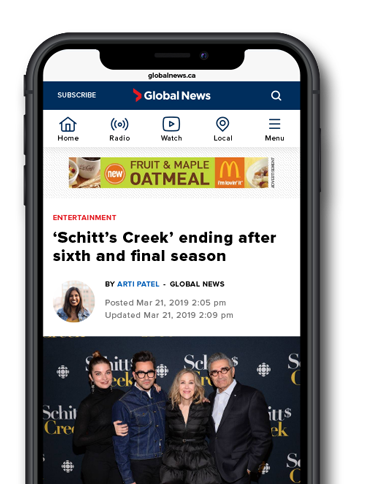

